zweitwerk

Zweitwerk creates precycled lifestyle accessories using production rejects from the automotive industry. Through recombination and blending with different materials and textures a piece of exceptional design and history is created. The communication and design takes up the aspects of complexity and perspective to tell the story of the products. 
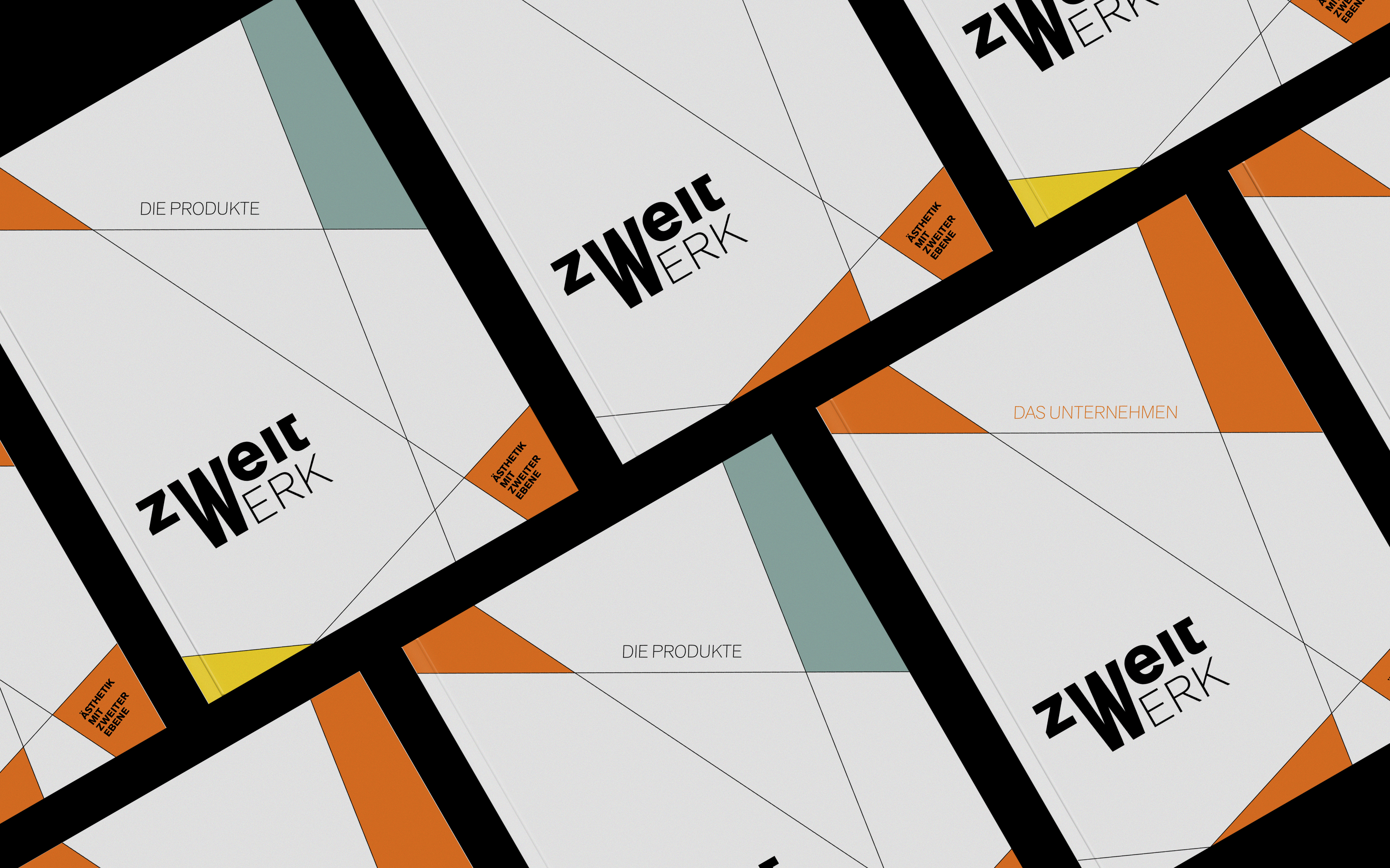
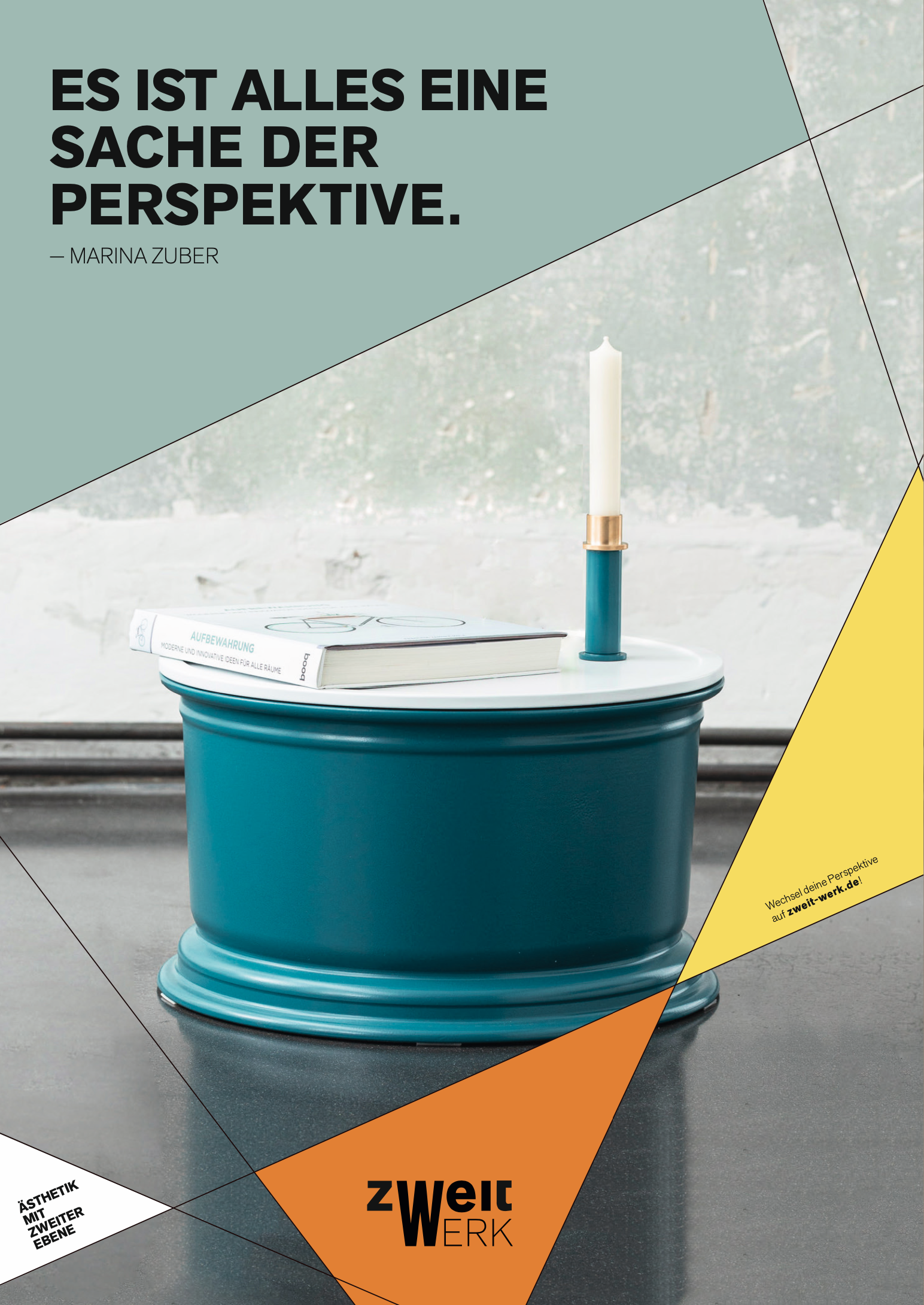
The corporate identity and design is based on the origin of the multilayered pieces. The foundation of the design consists on the construction lines, which form a new flexible system through recombination. Therefore, the same principles are applied to both, the products and the construction lines, which emphasizes the connection to the automotive industry. With rearranging the fine lines a basic system arises. This grid system can be alternated in multiple ways. Choosing different segments of the system, erasing irritating lines out of the sector, rotating the section and filling in the areas created by the lines in different colour combinations results in a very flexible system. 
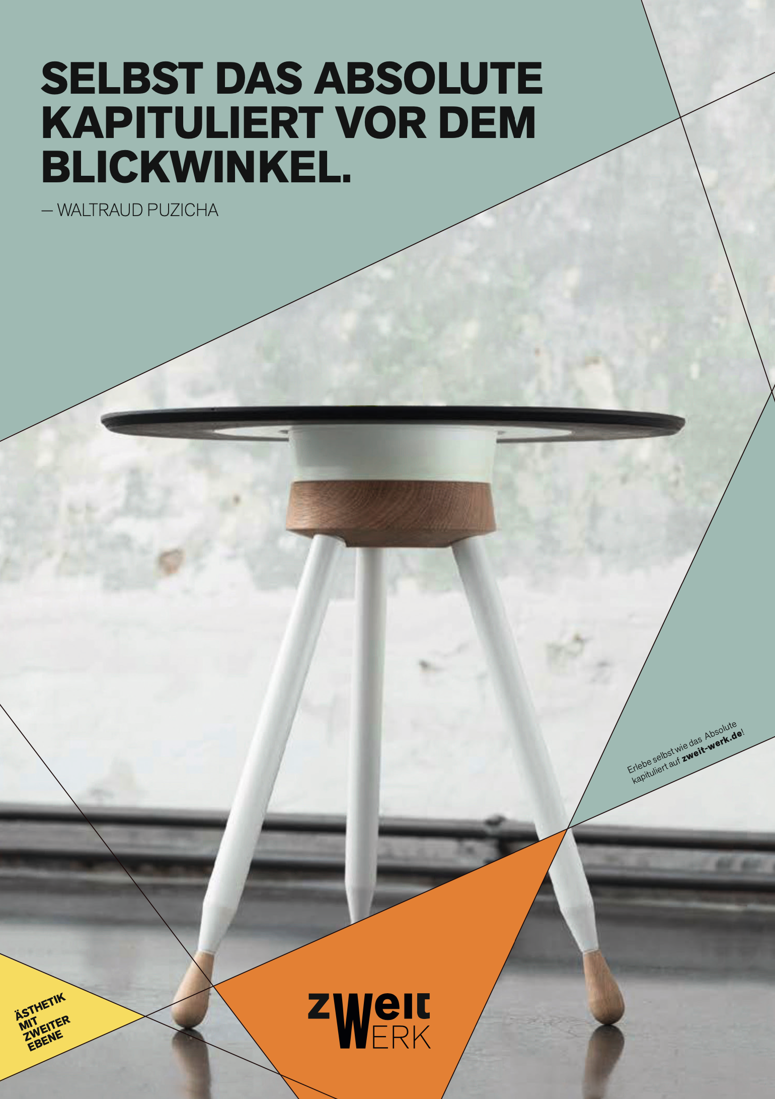
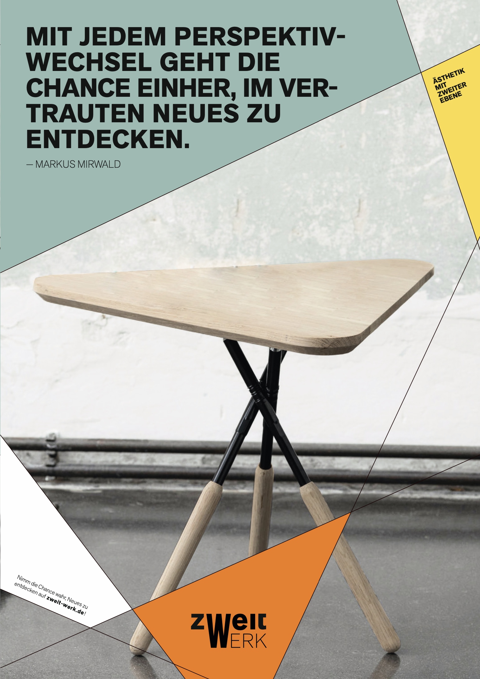
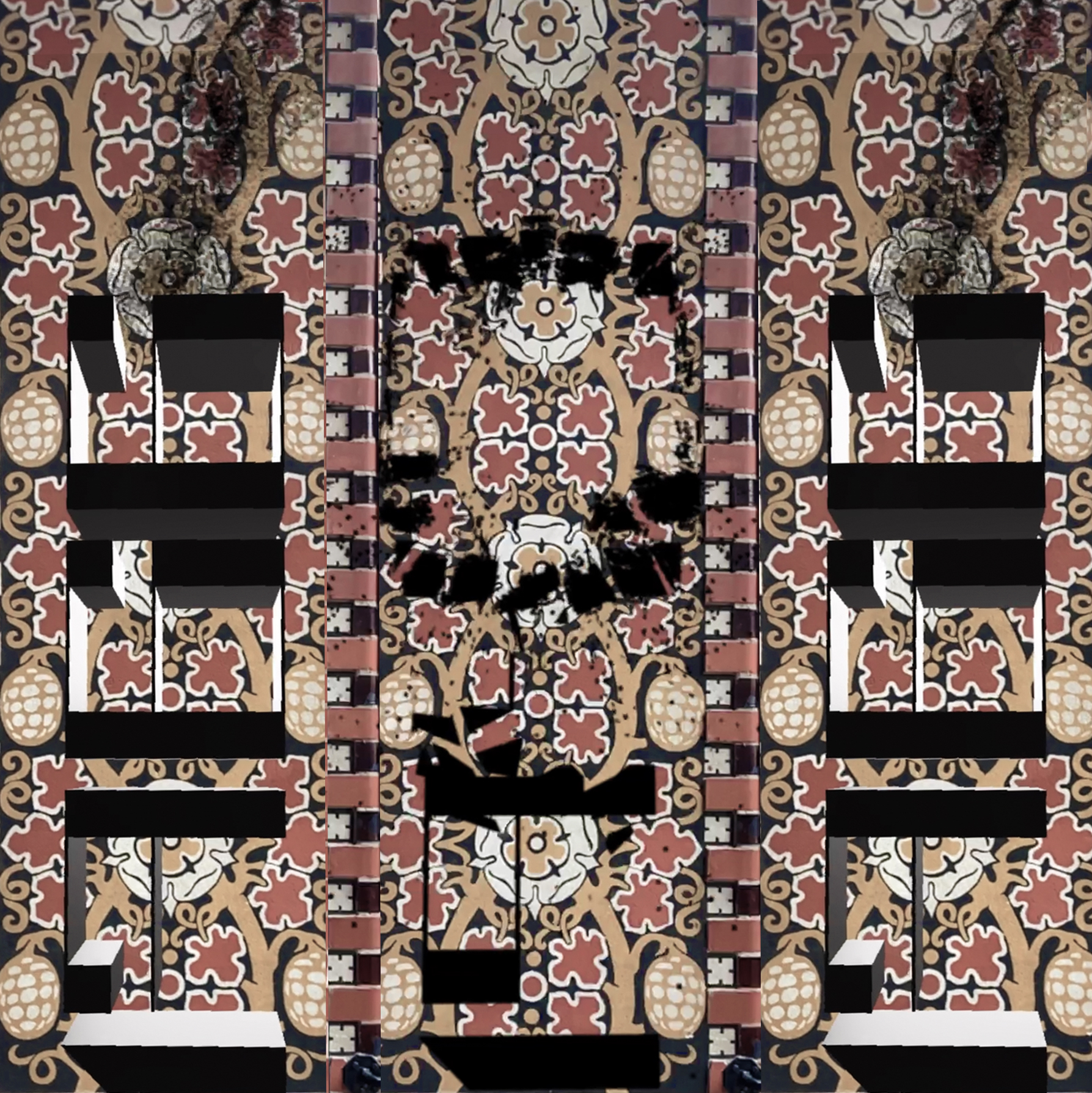
zweitwerk posterzweitwerk posterzweitwerk poster
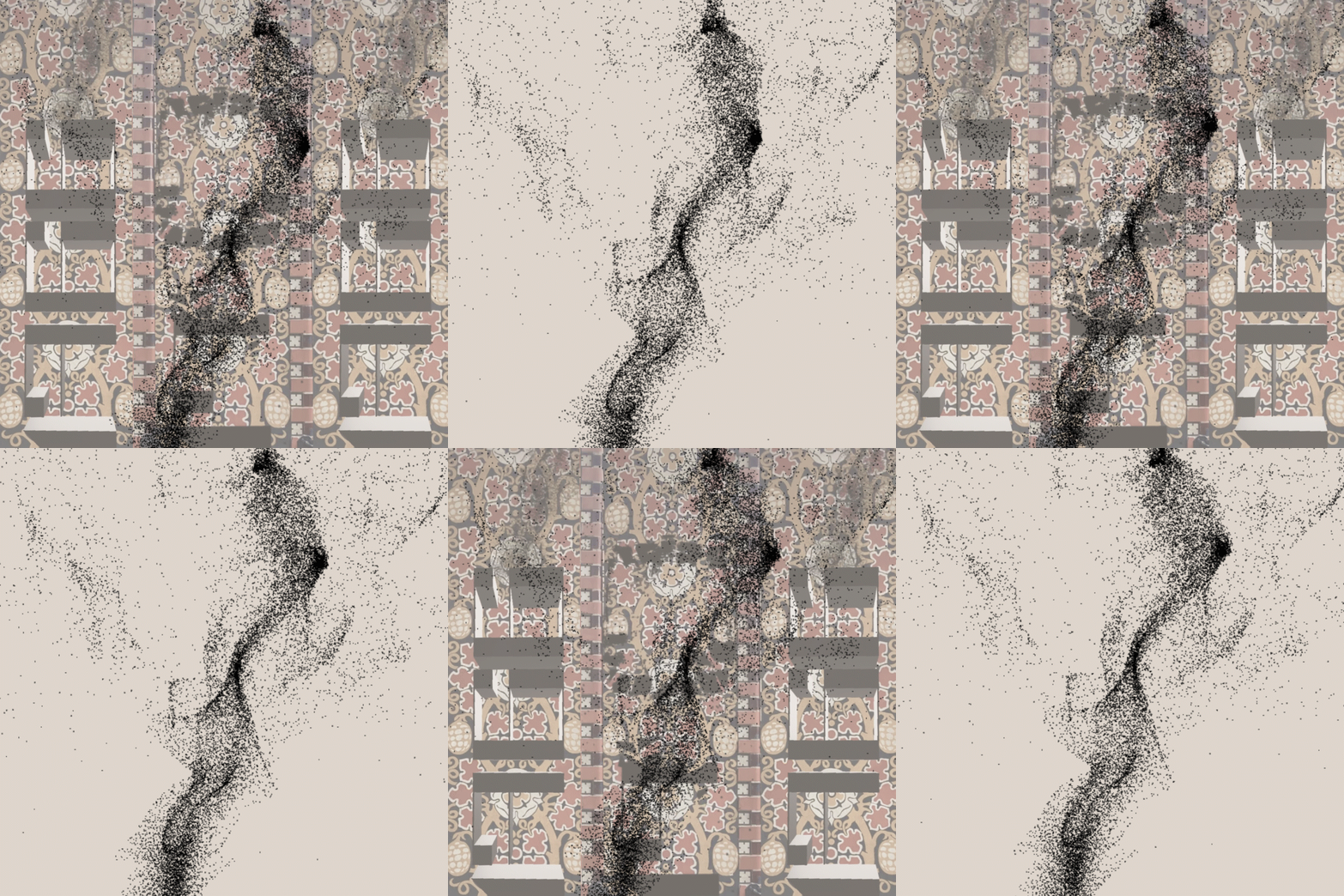
Posters do not only exist in a static form. With animation, the exact message of the poster is realised in motion and the viewer's attention is attracted in the urban space.
zweitwerk image and product catalogue cover
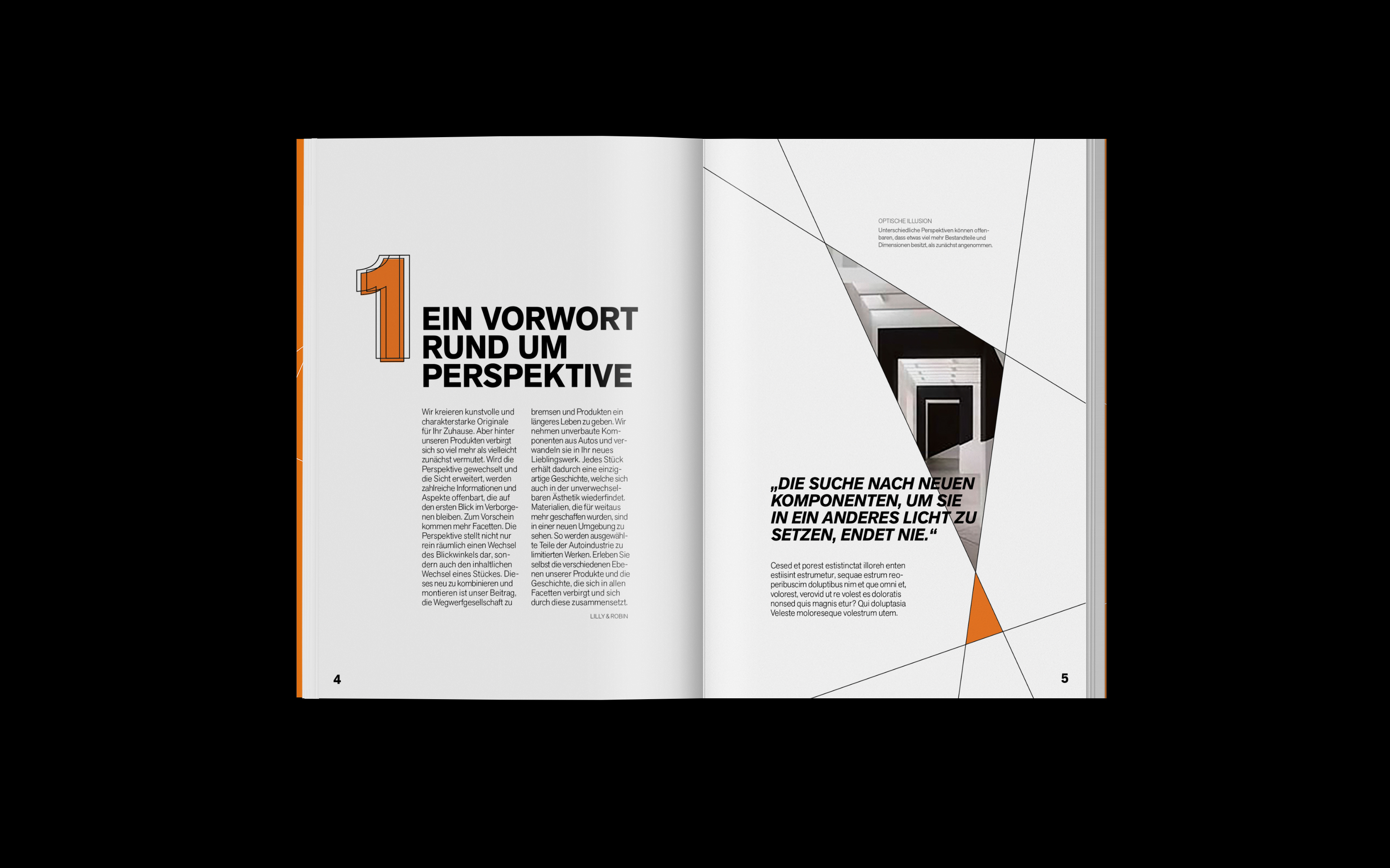
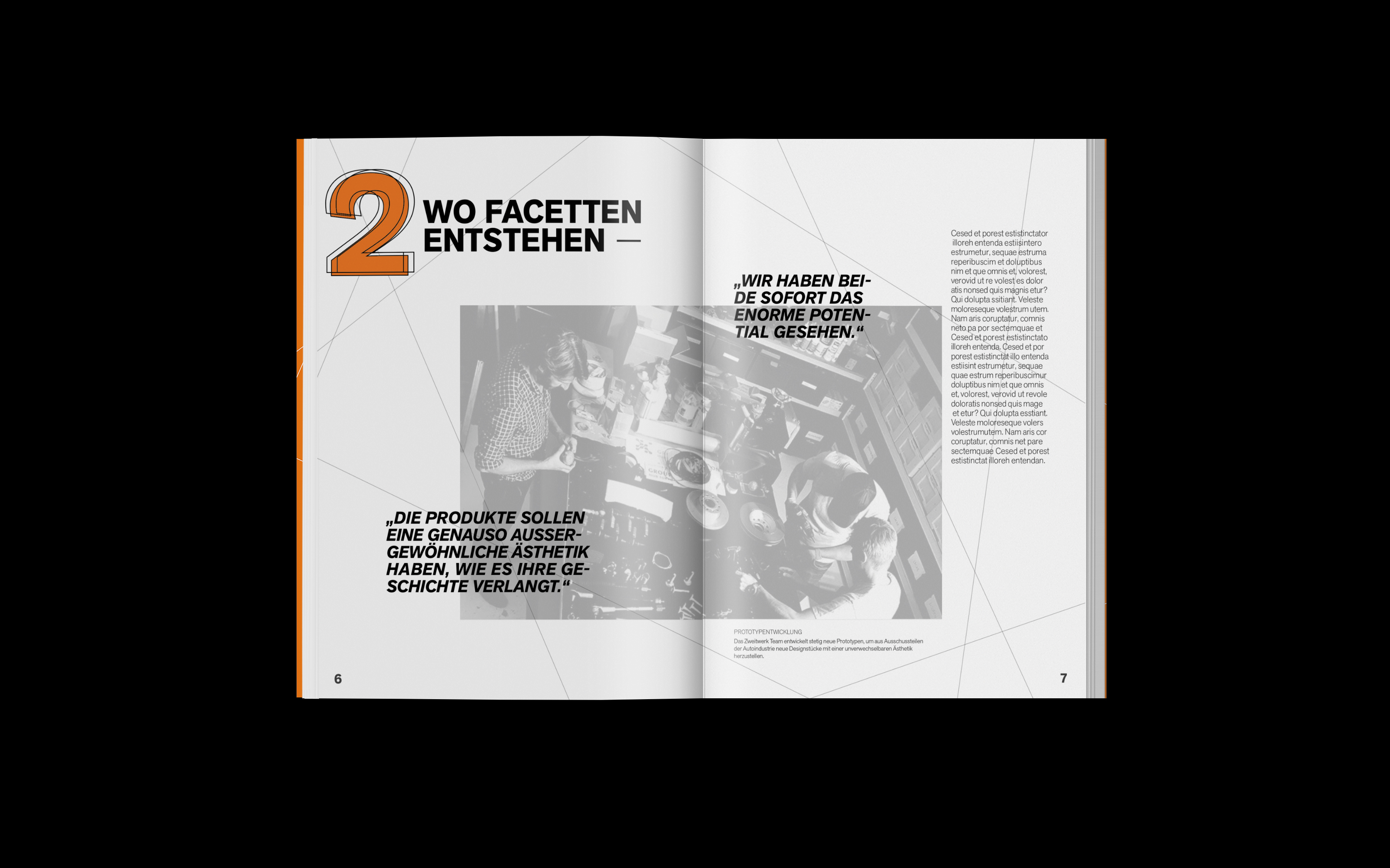
zweitwerk image catalogue introduction
zweitwerk image catalogue company background
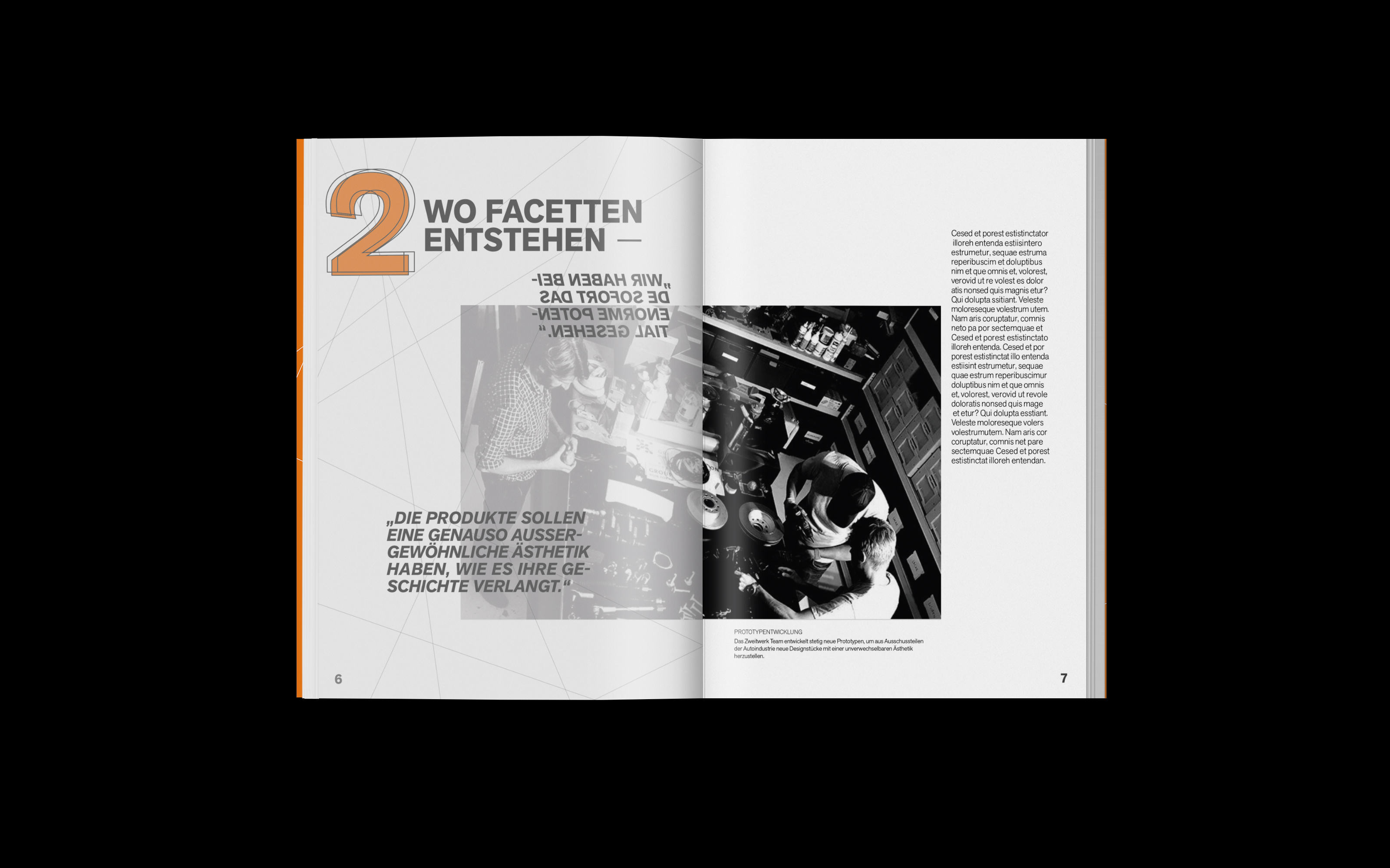
zweitwerk image catalogue company background transparent paper
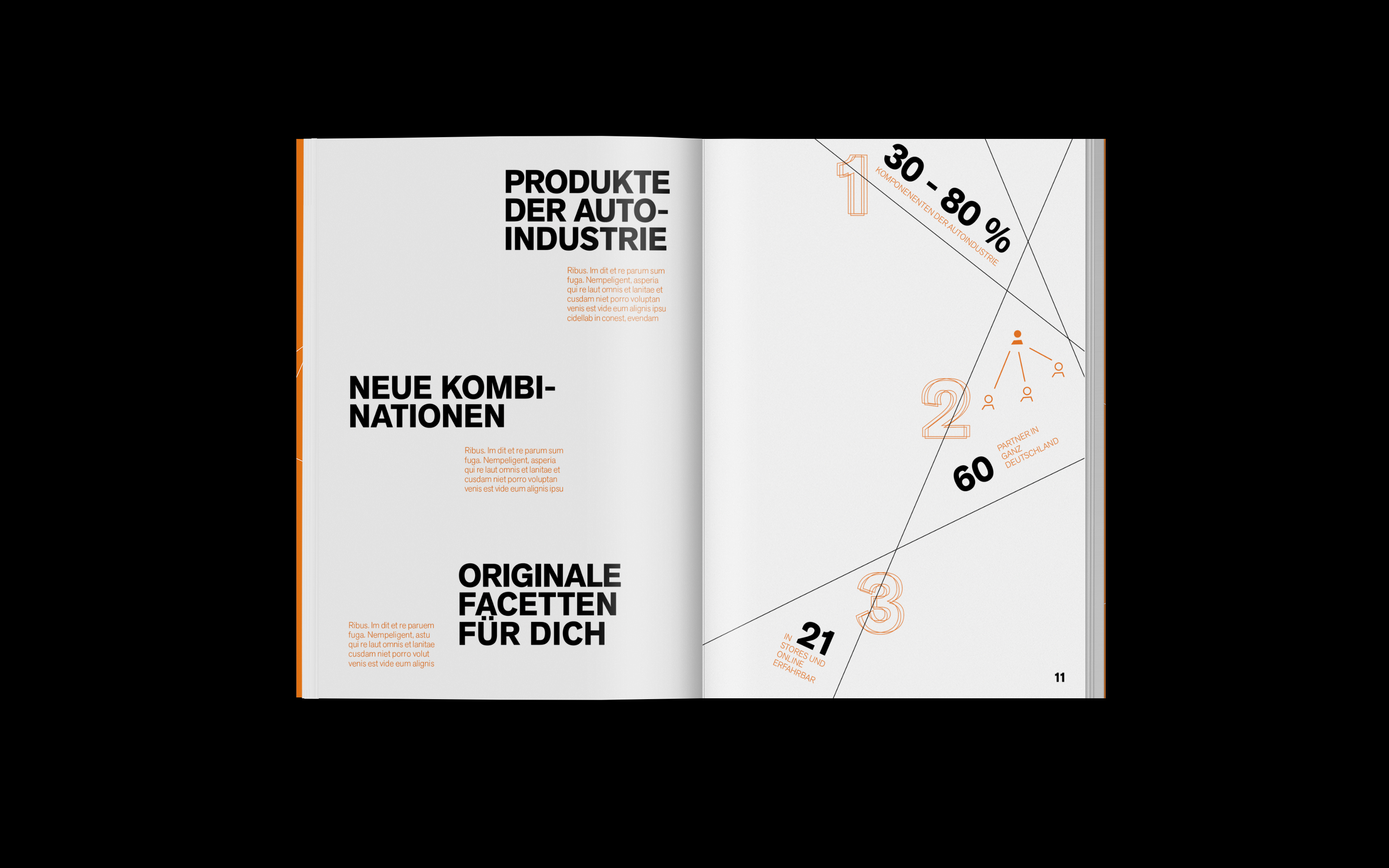
zweitwerk image catalogue infographic
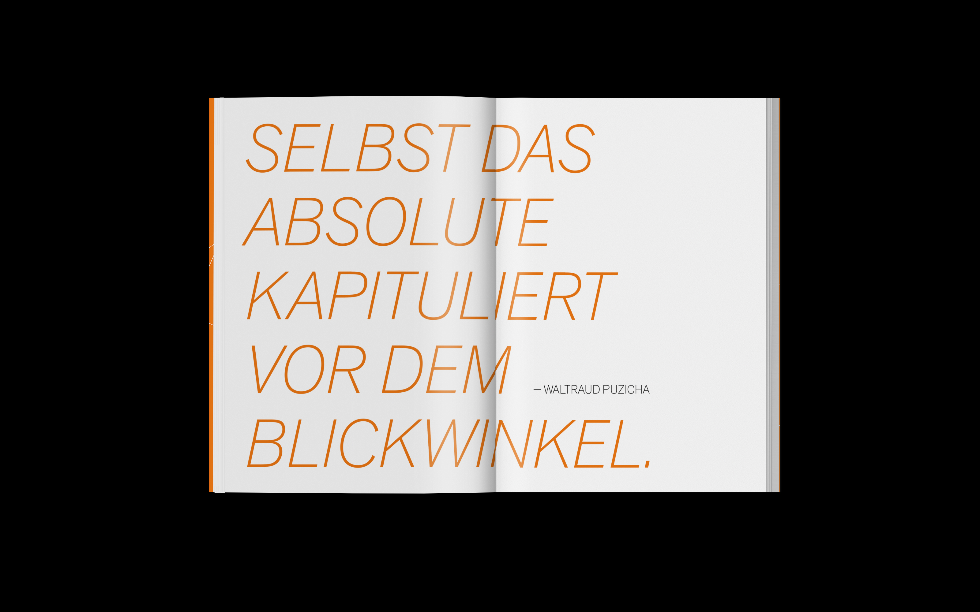
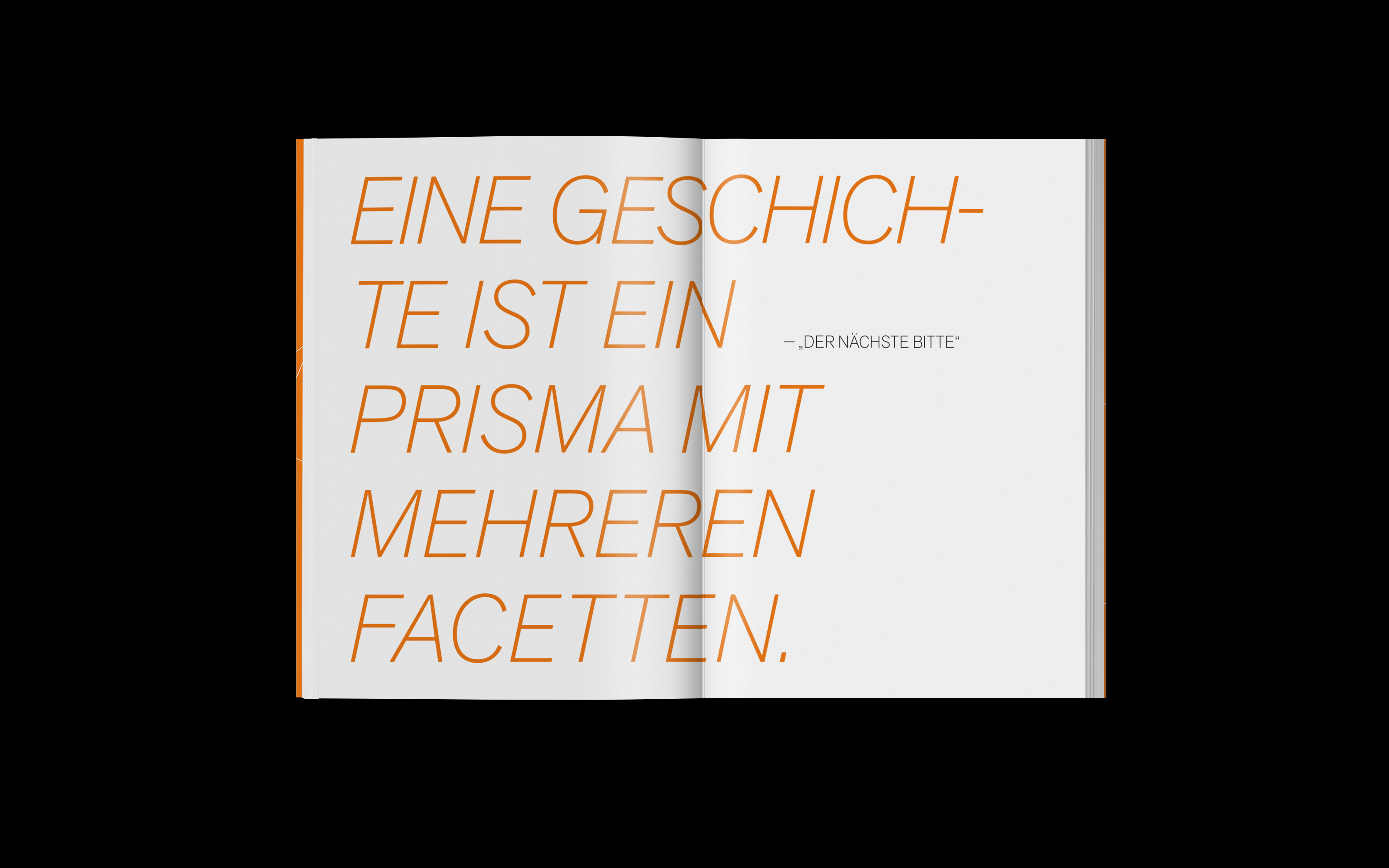
zweitwerk image catalogue quote
zweitwerk image catalogue
zweitwerk image catalogue transparent paper
zweitwerk image catalogue quote
zweitwerk image catalogue
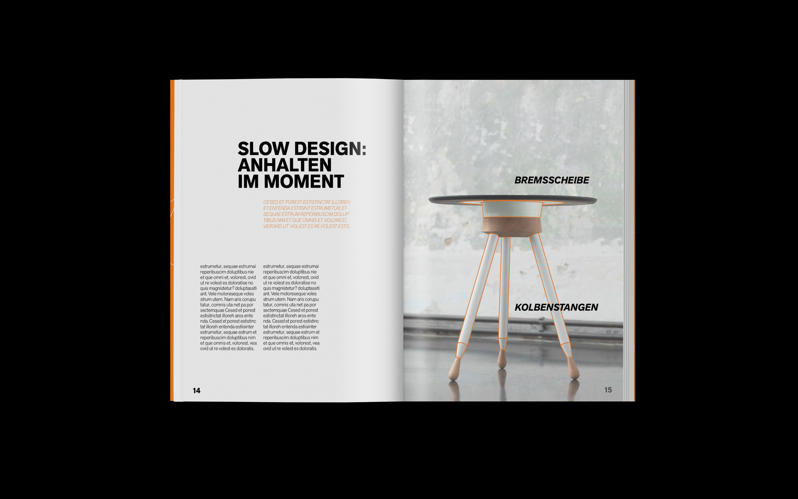
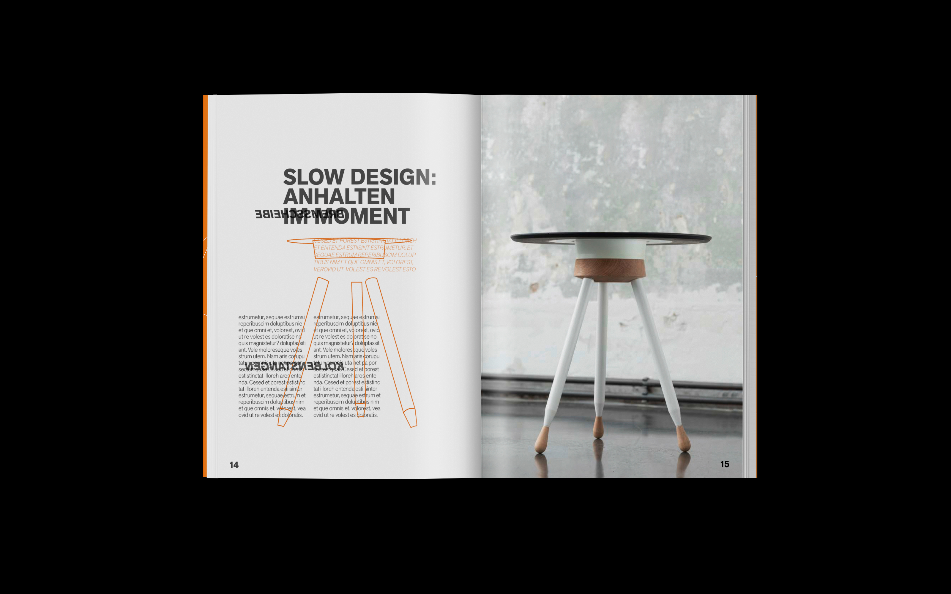
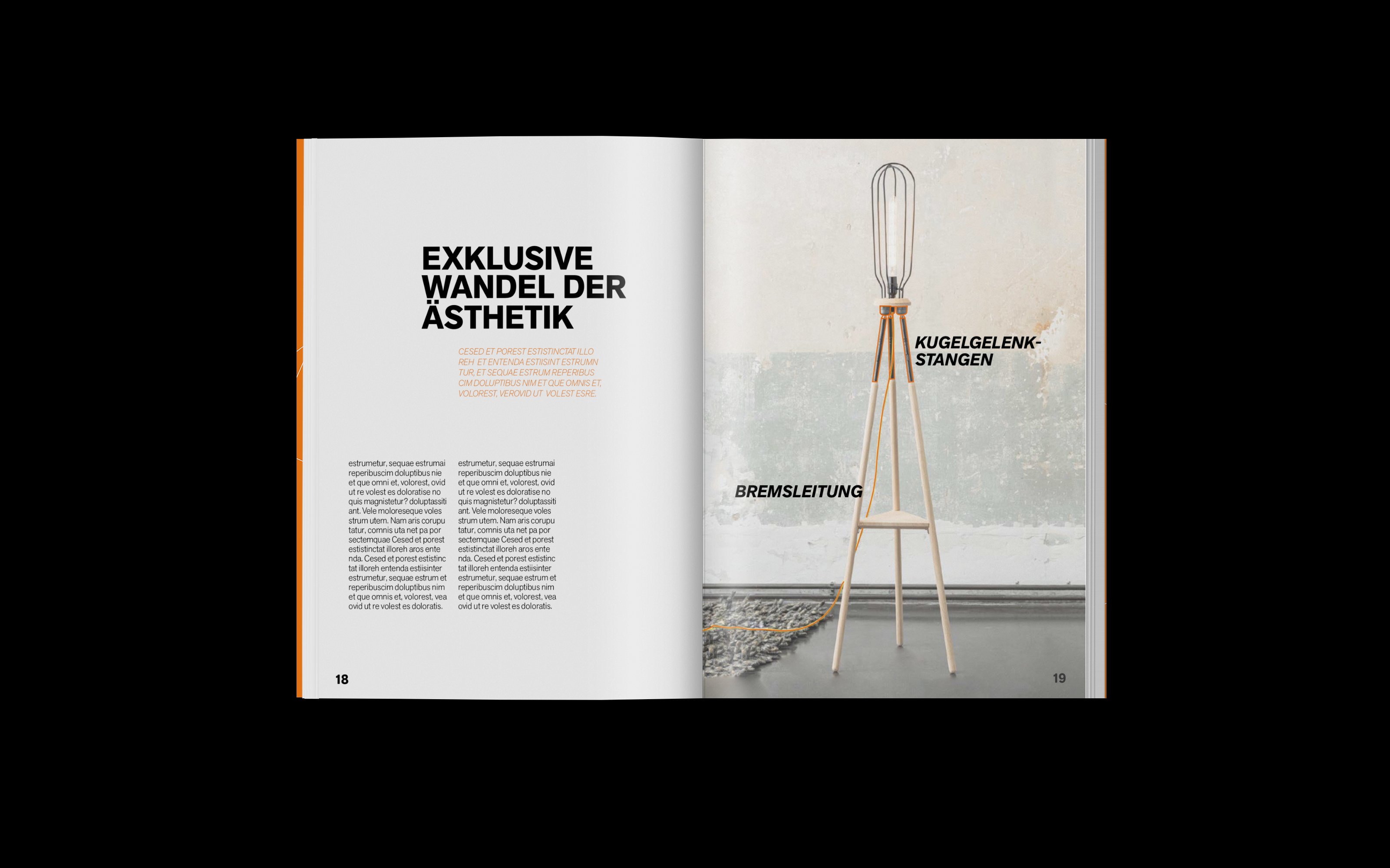
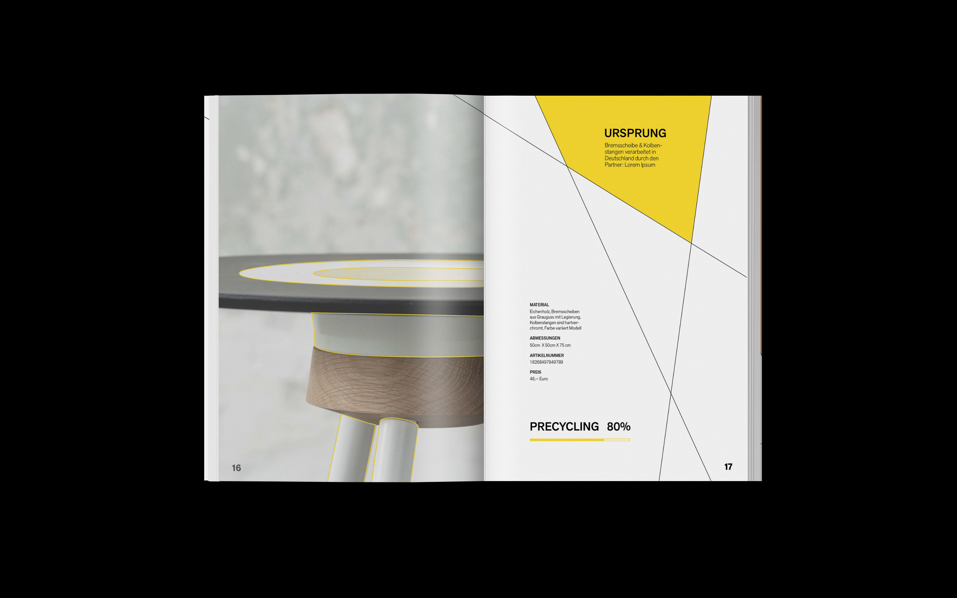
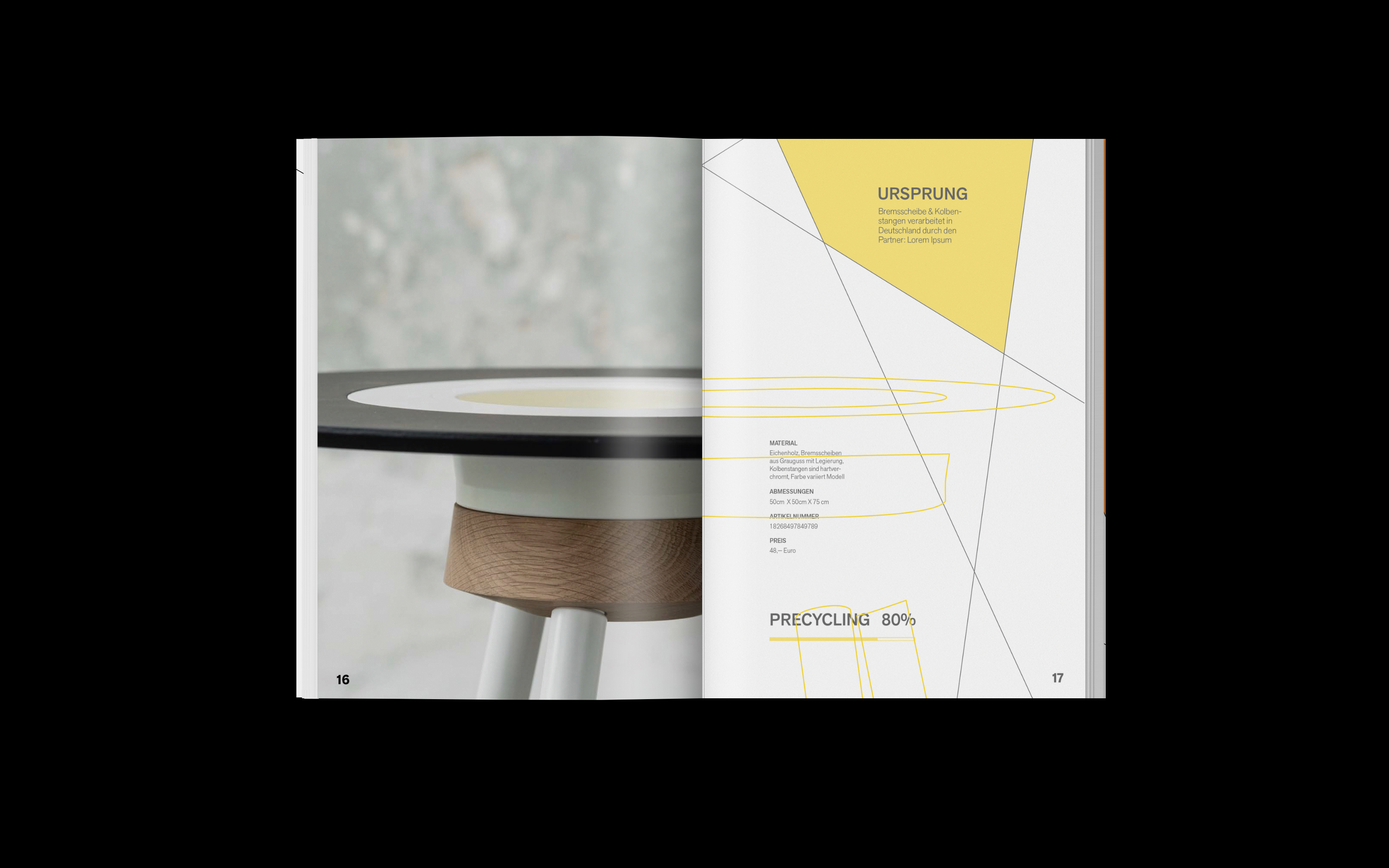
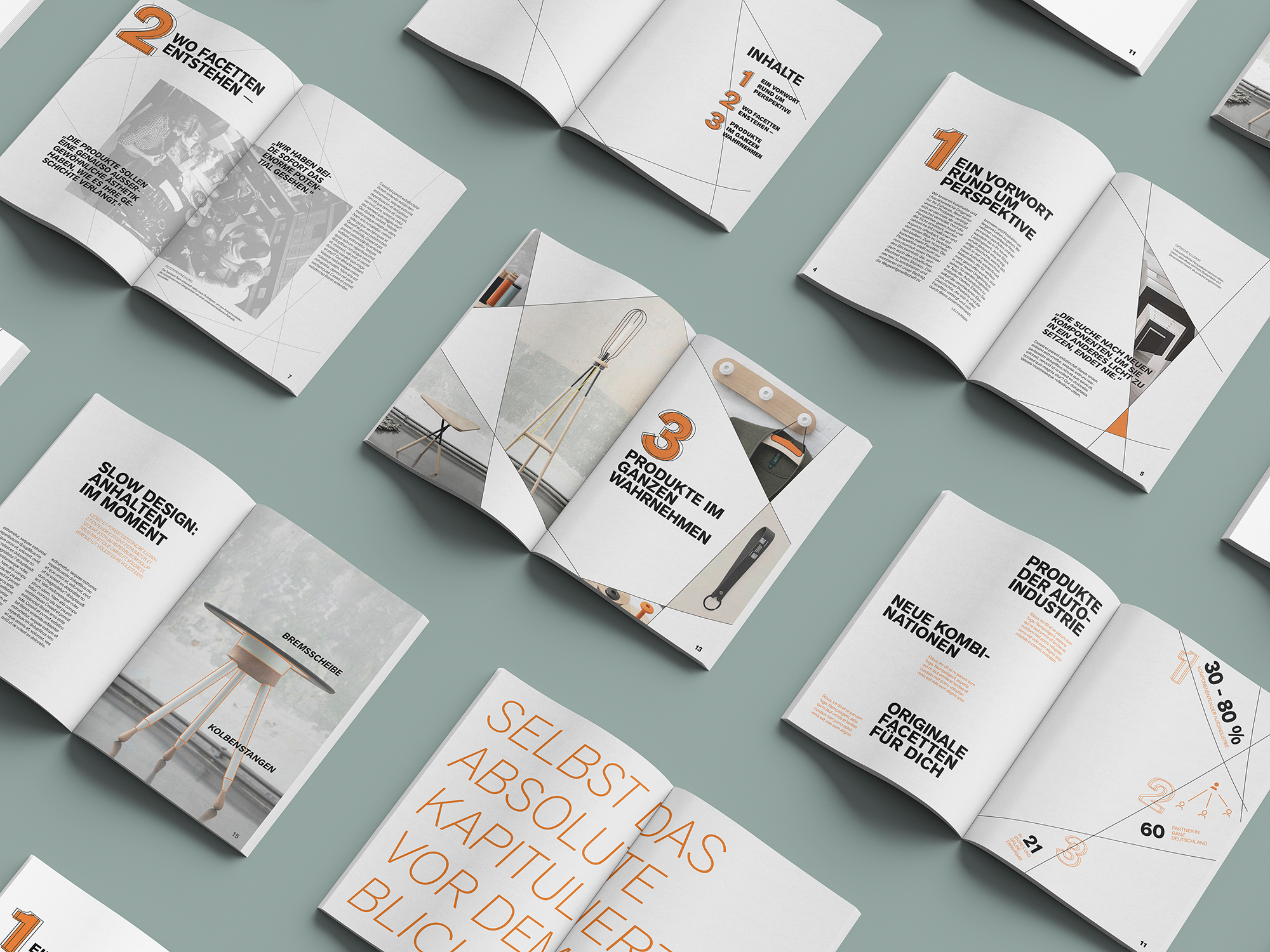
The system is used in its different variations. In order to reduce dominance and repetition the system isn’t applied on all pages. Additionally, transparent papers are inserted to communicate the multiple layers through the materials. On these, illustrations visually highlight and name the individual components from the automotive industry. 
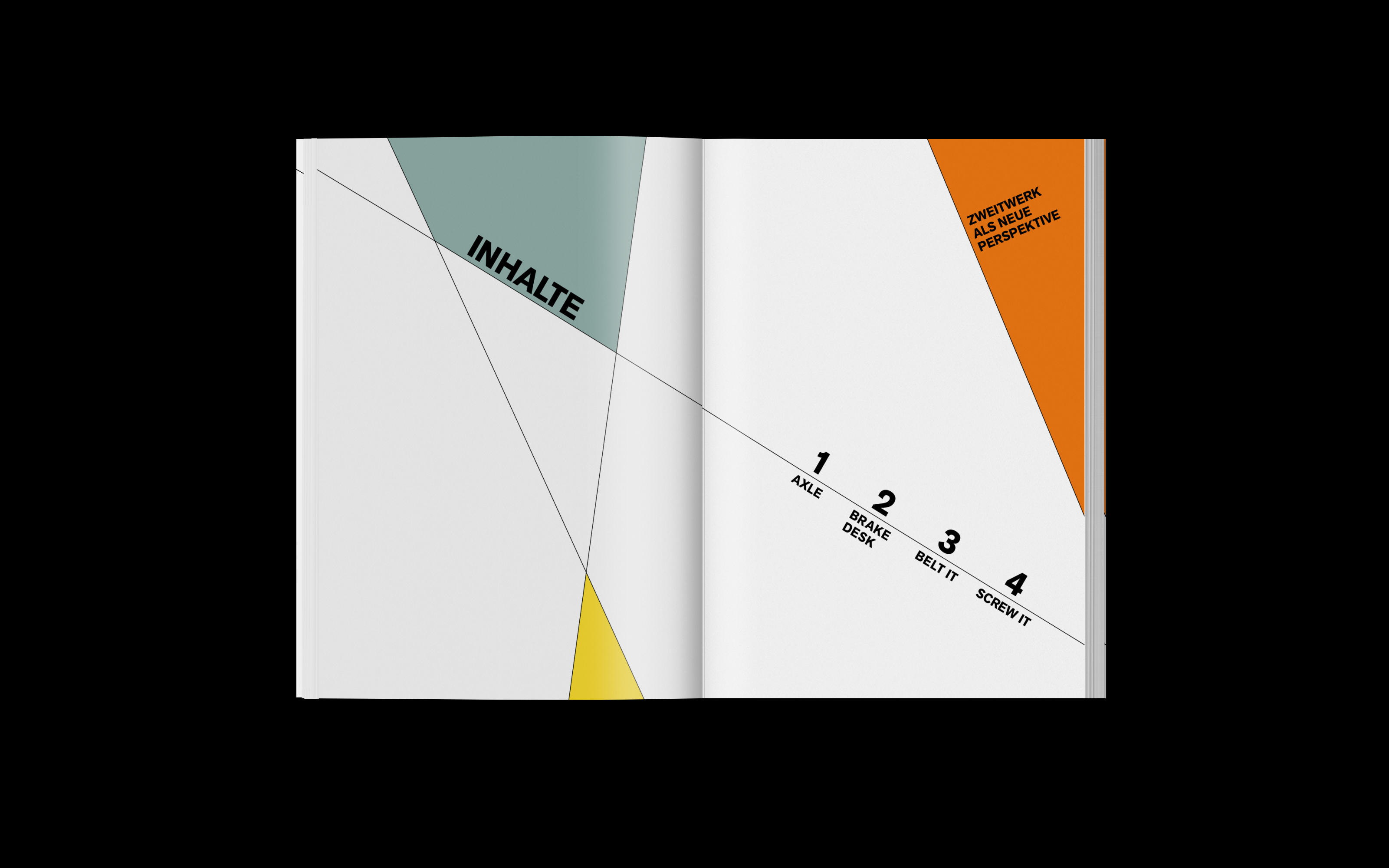
zweitwerk product catalogue table of contents
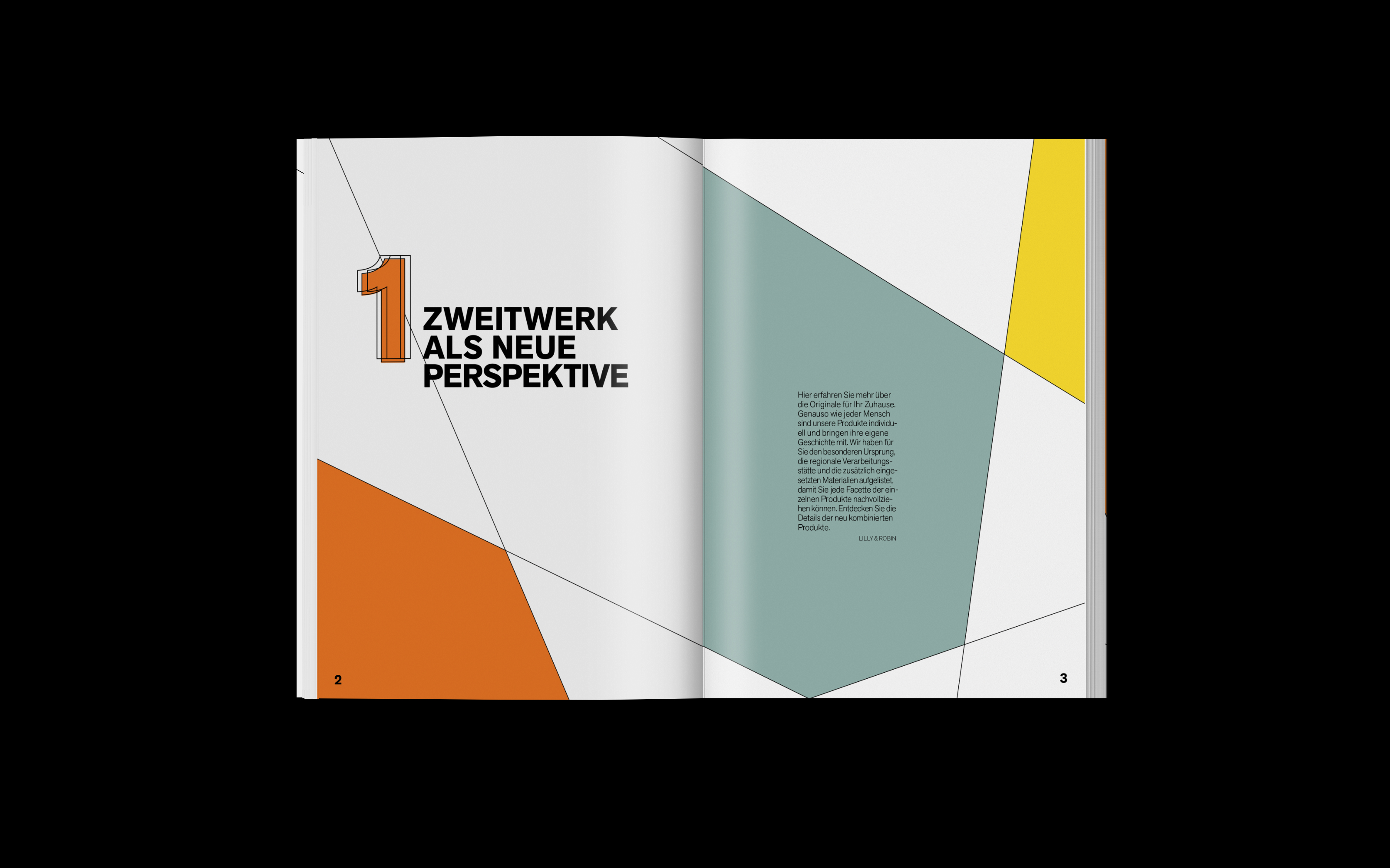
zweitwerk product catalogue introduction
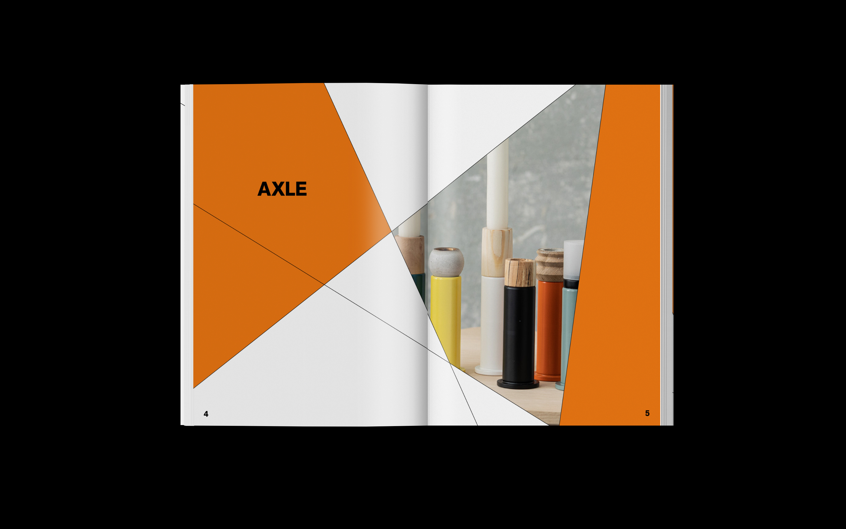
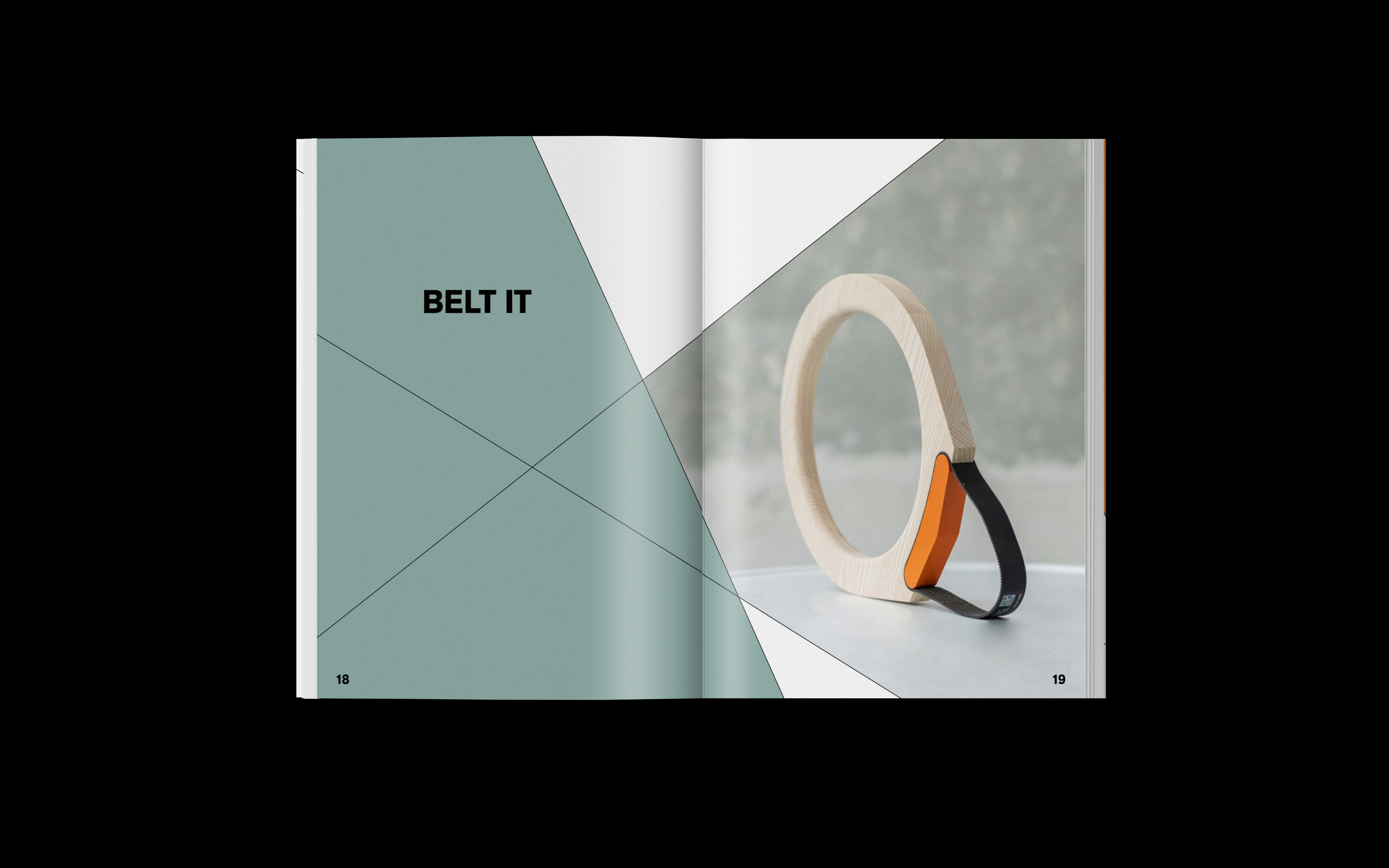
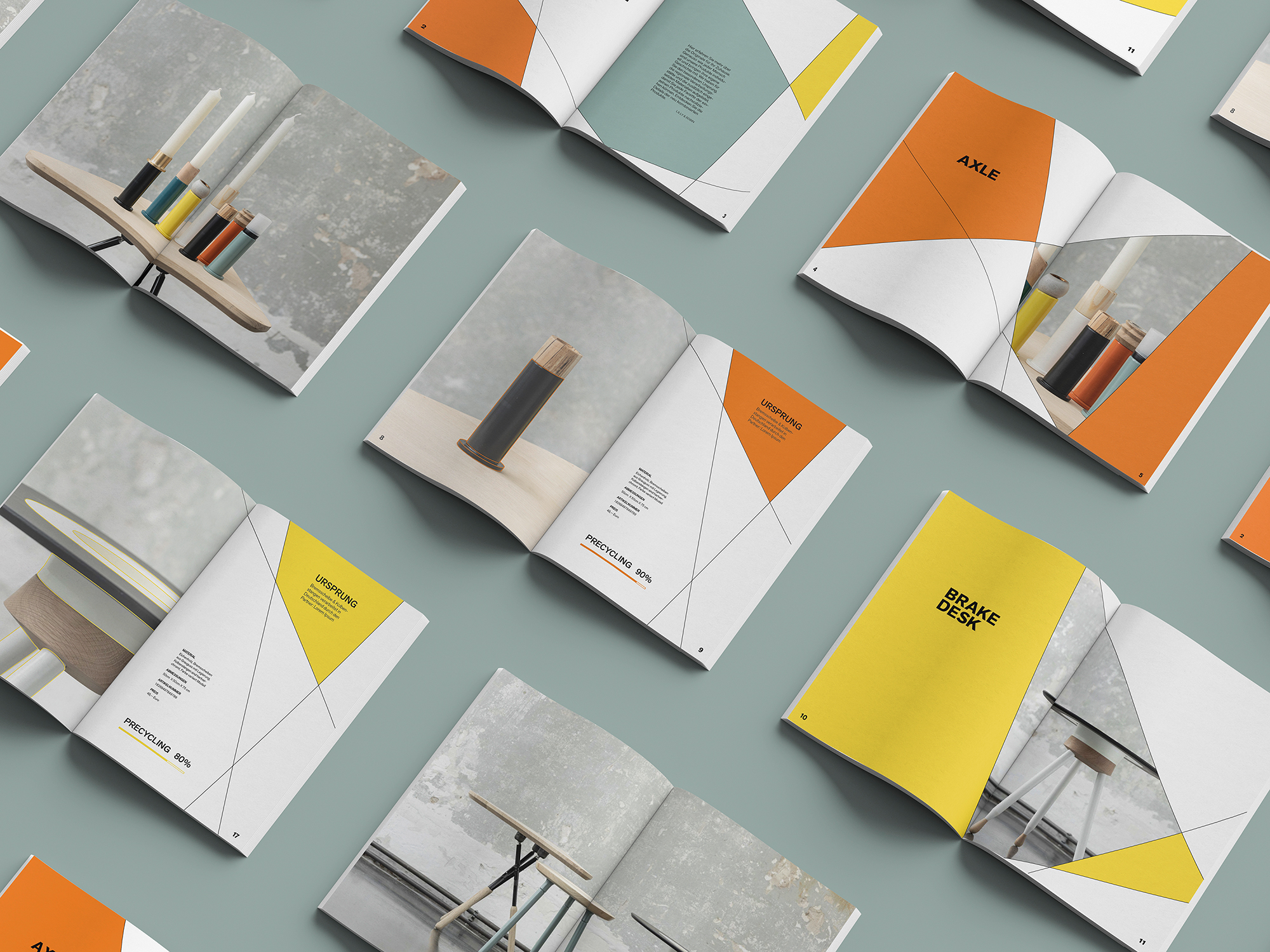
zweitwerk product catalogue dividing page
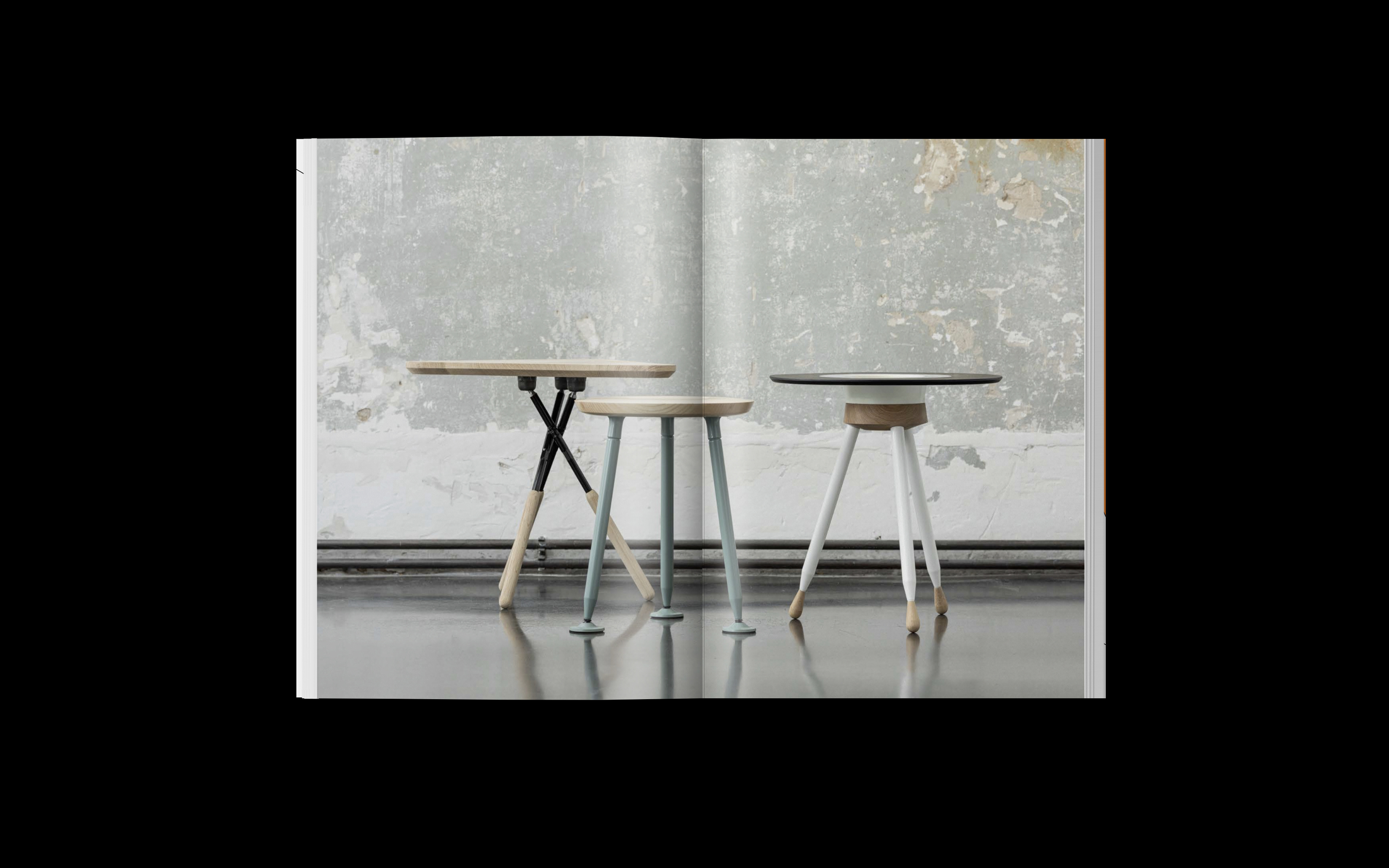
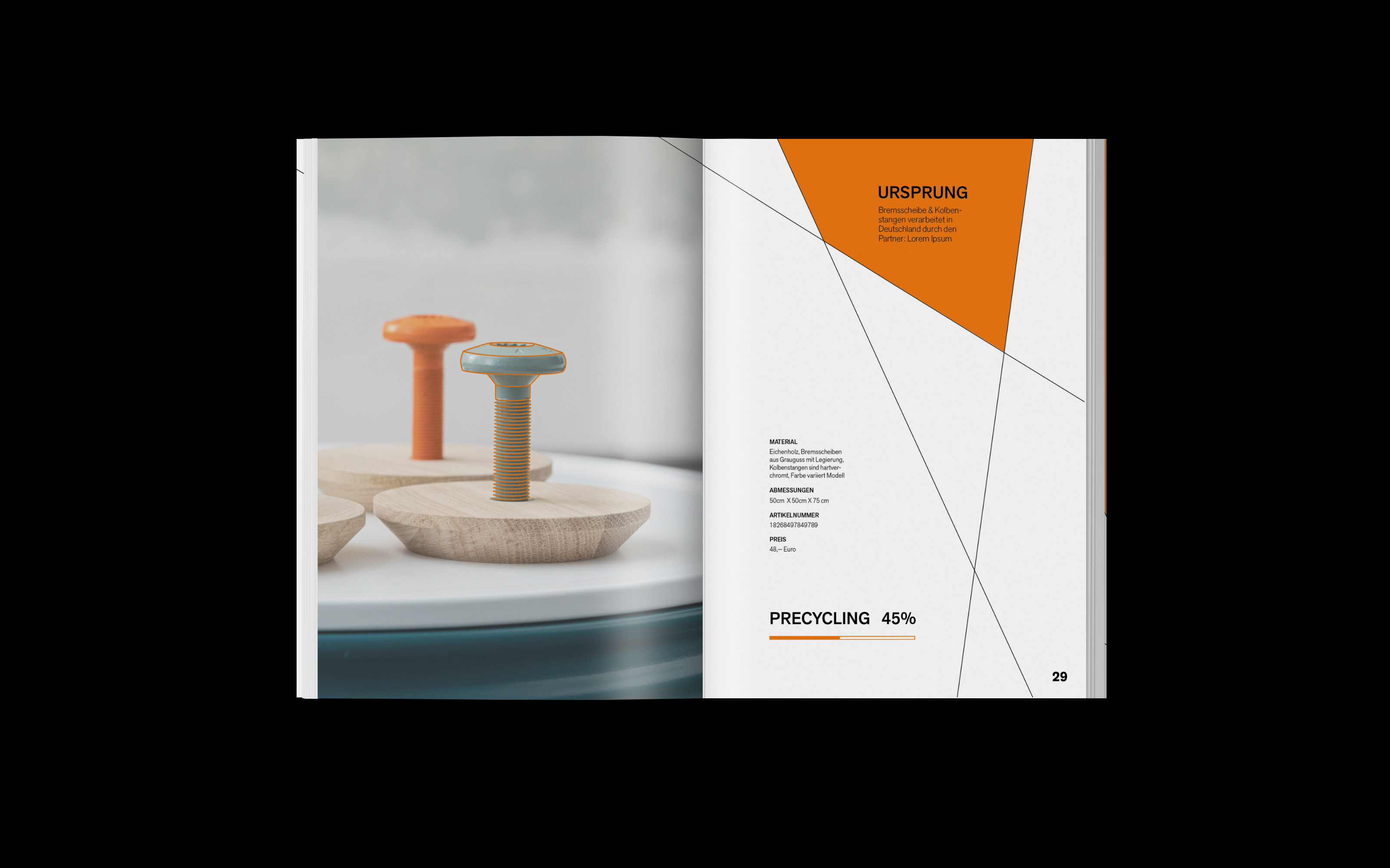
zweitwerk product catalogue
zweitwerk product catalogue product details
zweitwerk product catalogue product details transparent paper
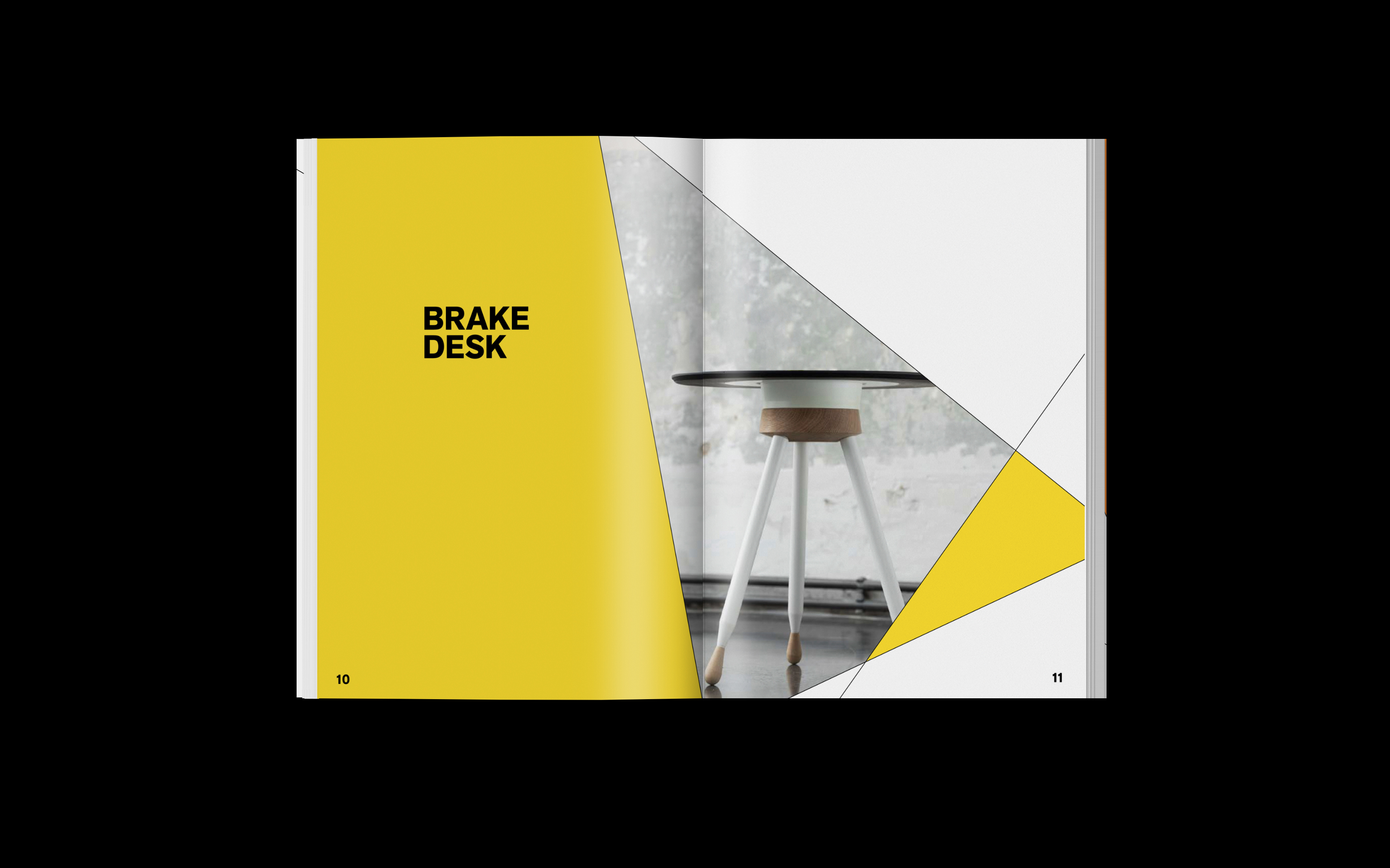
zweitwerk product catalogue diving page
zweitwerk product catalogue product details
zweitwerk image cataloguezweitwerk product catalogue
The spatial design is applicable in the flagship store located in Berlin, as well as in branches of the dealers. The installation divides the word mark into individual components, which are attached at various heights by transparent suspensions. Through different positioning and scaling of the individual components, the shadows of these components finally reflect the word mark in the correct proportions. At the same time, the installation serves to showcase smaller zweitwerk products. If the position of the components changes, the balance within the word mark is disturbed and the proportions unbalanced. In the background a screen is located that shows an animation of various zweitwerk products. It functions as a digital product catalogue. This is also particularly interesting for distribution in the individual Volkswagen branches with limited space. In this way, the complete product portfolio can still be presented. A connection between the screen and the room is created by the system, which is continued outside the animation. 
Through the website zweitwerk's products are made tangible and the individual facets of these are shown. The system becomes particularly visible through the product images, which are the shapes of the caleidoscope or grid. Additionally, the lines of the system themselves appear after actions performed by the user and moments of surprise. Moreover, through overlaps and shifts the multilayeredness is also visually represented. The website is designed in a way that each sub-page invites the user to linger with small animations. Yet these animations do not restrict the user from moving quickly through the website. Contrasts are made between very calm and flowing movements and fast and dynamic actions to capture the user's attention and interest. Furthermore, the corporate colours are used to accentuate and highlight the call to actions. Text and image operate on two decoupled levels. In this way, the animations of the products can be continued and at the same time new information can be displayed based on the user's action. The user’s experience depends on his or her behaviour on the website. This variability increases the recognition of the design and the attention of the user.

other projects